How to design a good digital user experience #2: prioritize focus and simplicity
Ever wondered why one website is easy to use whereas other sites only bring frustrations? Why you are happy to use that one particular app on a day-to-day basis and you would rather ignore other apps as much as possible? The thing is that, in most cases, the people that designed those practical and widely used products took the user’s needs and requirements to heart. As you will have noticed, far too often, a lot of websites and apps continue to sin against the basic rule of listening out to users’ needs. Which is why this practical guide is intended to help you avoid these frequently encountered mistakes in product design.
Every smartphone user knows that their phone slows down or may even freeze if they use too many apps all at the same time. Actually, this is pretty much the same thing that happens in the human brain. Our brains constantly use RAM memory at all times of the day, whether consciously or unconsciously. And this working memory has its limits. It'll start slowing down if it:
- needs to learn too many new things
- is overstretched by constantly having to juggle multiple tasks
- is asked to concentrate for too long
- is required to activate the memory too often
- is called upon to make too many decisions in a short space of time
- is expected to deal with frustration and confusion
Unlike computers, humans do not take extra working memory. Which is why our job as UX and UI designers is precisely to relieve users’ working memory. We can do this by showing the shortest and easiest route towards the desired result. In this respect, it's essential that we show information and features as simply and as methodically structured as we can make them. Go for K.I.S.S. - Keep It Simple Stupid!
So how do you strike the right balance? This blog sets out five practical tips to instill simplicity into your designs and ways to make user-friendly choices to benefit the users. Definitely worth a read!
Don’t make me think
Suppose you land on a website’s home page, which looks as shown below.
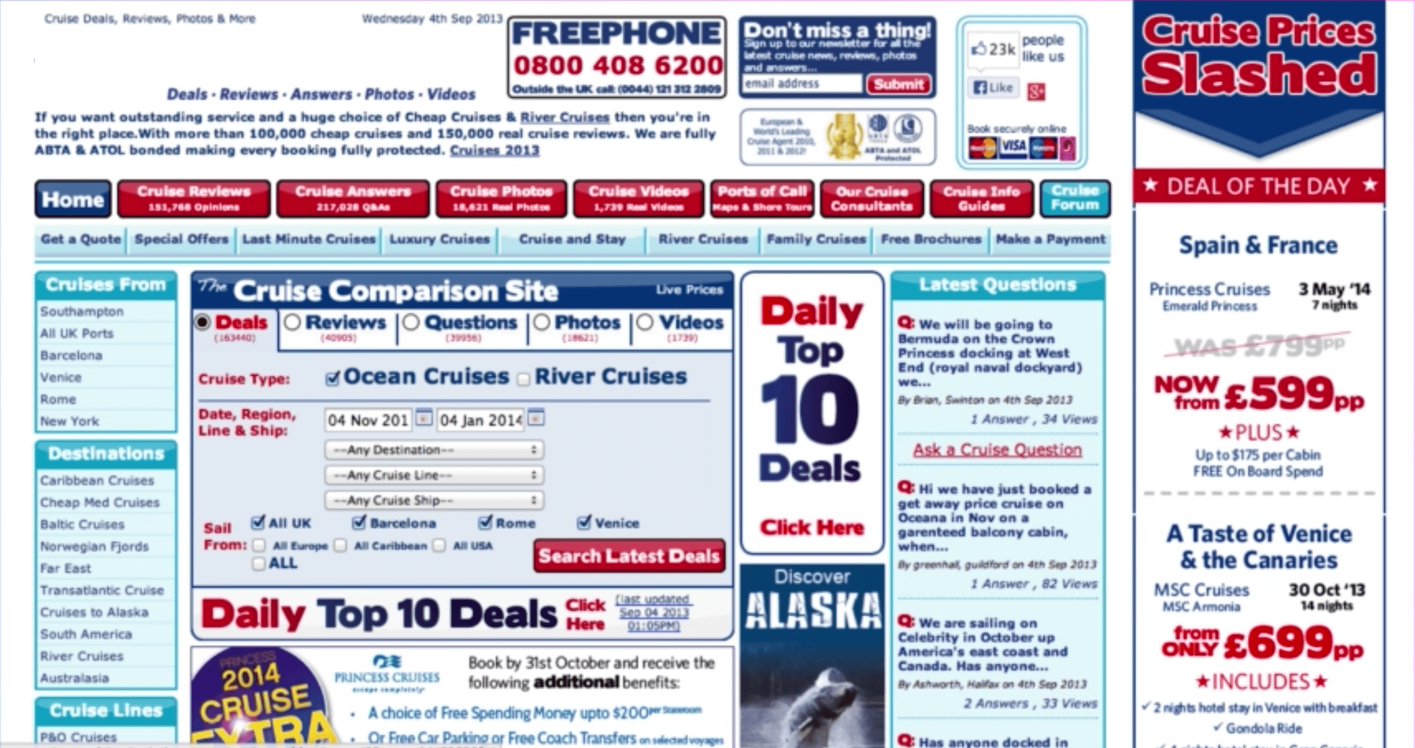
The information is neither particularly clear nor very structured. As a user, you then need to elbow your way through various pages and click multiple buttons. Moreover, you are also invited to create an account and to remember your password. Until suddenly… you’re logged out of your session. Wallop! Can you sense your frustration welling up? All of these barriers combined are a cause of considerable irritation, demand a great deal of concentration and place an unnecessary burden on your brain. What is worse, it stops you from achieving what you set out to do by visiting that website. Which is why it is vital that, as designers, we avoid cognitive thresholds in the interfaces we build, and ideally elsewhere across the entire customer journey. Steve Krug’s book “Don`t make me think” is a definite must-read on this topic.
So, we now know that every extra element on the page raises the complexity of the interface as a whole and consequently has a negative effect on the way our brain works. Here are five ways to keep your designs simple and focused.
1. Make sure each page has a clear hierarchy
People scan a web page by sight, reading that page in the reading direction they are most familiar with. Eyetracking research by NN Group shows that Z patterns or F patterns are very prevalent, especially among readers from the Western world who read from left to right. Users that adopt an F pattern first scan the page in a horizontal movement, usually starting across the top part of the page. They then go down the page a little and continue to read in a second horizontal movement. Finally, these users scan the left hand side of the content in a vertical movement.

So make sure the main item you wish to draw the user’s attention to is the central point on the page. In the example seen below, the call-to-action button is the central stand-out point in the mail.
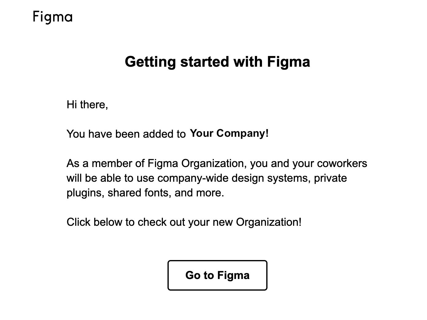
Be aware that users will often not even bother reading the text but will directly click a button instead. So focus on the actual call-to-action!
2. Don't make me remember
Do you know how many passwords you use online? Do you know all of these passwords by heart? If the answer is yes: congratulations, you could well be a super genius blessed with an incredible memory. Unless you are using the same password wherever you go, which is not exactly the safest way forward either.
If your answer to these questions is ‘no’, you are like 99% of the population, and feel slightly panicky whenever you’re asked to enter your login details.
Remembering passwords is an everyday battle for many users of the modern web. Tackle the root cause of the problem and stop users from getting frustrated when they are asked to perform actions for which they need to call on their memory. Which is why automating the login process is a must to deliver a positive user experience. One way of achieving this is by way of a login they often use, as with Google accounts. You can also allow a different integration so the user is able to manage their passwords (e.g. LastPass).
In e-commerce, you can enable users to check out as guests. This is every bit as much a commercial decision, and one that makes sure users are able to swiftly and easily check out and pay for their shopping basket.
3. Speak the user's language
This is an element that is often overlooked. Precisely because good copy is very clear and simple, it often does not get the attention it deserves.
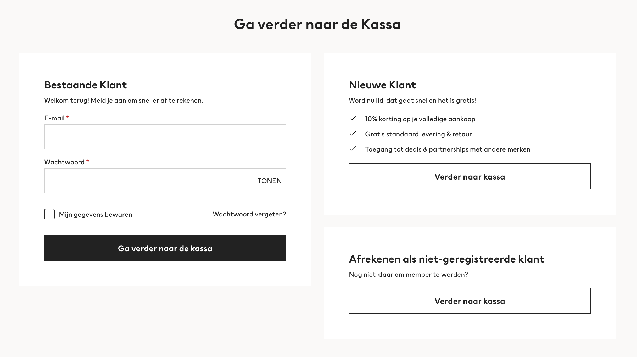
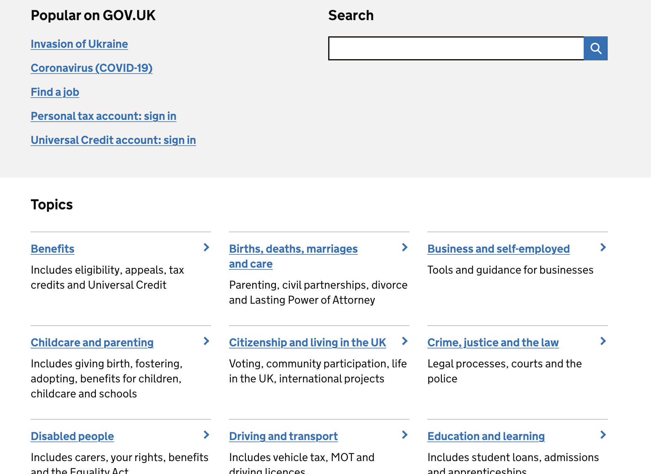
One example of confusing jargon is seen in the login process. How do users understand ‘logging in’, ‘signing in’ or ‘registering’? Give the words you use a great deal of consideration so the copy speaks for itself. And be consistent in using the same words throughout the entire interface.
The thing that stands out in this example is the simple and straightforward copy. Difficult concepts are described using clear and comprehensible words to make sure every user understands.
4. Goals before options
What is your favorite? Pasta, fries, pizza, meatballs in tomato sauce, beef stew...? A salad? Or would you say you have more of a sweet tooth? Struggling to choose? In that case, you're likely to suffer from choice overload. And you are not alone in that. When our brain is faced with too many choices, it is required to process too much information all at the same time, which is what gives us choice overload.
The same applies in the digital realm. Showing all of the options on-screen at once stops people from continuing their visit. Too much on-screen information is overwhelming and may create a bottleneck. Our brain is limited in the amount of information it is able to process at the same time. So simplicity also means you do well to limit the number of steps or options the user is presented with on-screen. This enables the user to focus on the task he is performing right there and then.
Rooted in psychology
This idea is based on Hick’s Law. This psychological principle says that the amount of time needed to make a decision is based on the combination of the number of choices and the level of complexity. When the level of on-screen complexity increases, it also takes people longer to make a decision.
If your user is forced to go through a complex process anyway, break up the process into logical steps or limit the number of options. This can be done by only showing certain parts of the process on-screen at the same time.
Take checking out on an e-commerce website for example. Instead of presenting the entire process in a lengthy, complex form, break it down into logical steps. First ask users to register their e-mail address and create a password (or enable them to check out as a guest). The next screen could have the details of their shopping basket, followed by another screen that collects the delivery details, etc.
Reducing the number of options on-screen makes the payment process more user-friendly, thereby increasing the likelihood that the user reaches the end of the process and pays for the items in his shopping basket. This is a good way of restricting abandonment behavior.
Don't overdo it
That being said, do not be too quick about scrapping certain options or steps either! It is important that no elements are left out that support the user’s primary purpose for visiting the site in the first place. In other words: always bear in mind functionality from the user’s perspective in limiting the number of choices he is asked to make.
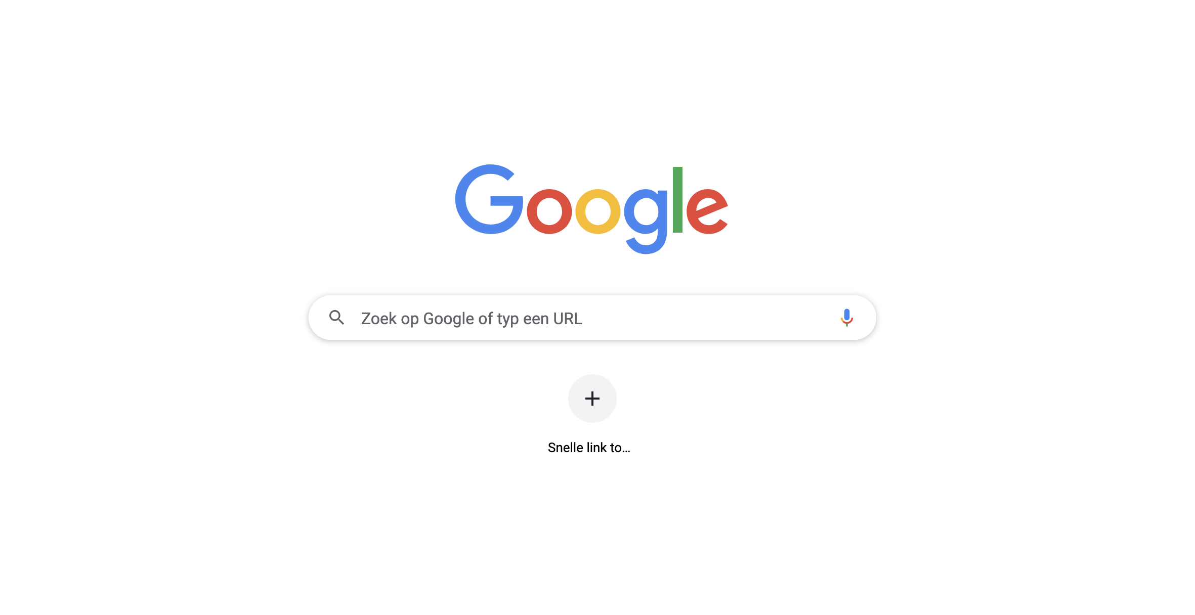
Google for instance focuses on one thing only, which is main thing the user is using the search engine for, and that is to run searches.
Another thing that can be helpful is to test the interface with people who are more likely to come up against the limitations of their working memory, such as elderly people or people with ADHD. What we are saying is: try testing out your designs with your nan or grandad!
And do not be too concerned about the number of times a user is asked to click a button. Users do not usually complain about the number of clicks. What they do get frustrated with is the length of time it takes to complete the task or to find the right item. And the thing that drives away users is pointless clicks. Do not count the clicks, make the clicks count!
“Consumers want websites and apps that enable them to make smart choices.”
The main thing to remember is that our job is to help users complete their actions swiftly and with ease. Part of that job is to get rid of the least appealing alternatives. Another thing that helps is to offer them different basic functions such as search, sort and filter. This makes it easy for users to find what they are looking for. Or go for a personalized approach and enable them to decide what is shown on-screen.
5. Create visual calm rather than overstuffing the screen
White space is very often greatly underrated in interface design, in the same way as silence between musical notes. Yet white space is a powerful way of restricting the amount of visual input and keeping people on your page.
Websites and apps often feature a great many different visual elements. These include words, blocks of text, lines, icons, images, etc. The space between these separate elements is what we call white space. The more white space between the elements, the more calm you instil in your interface and the less noise the user has to deal with on-screen. As a designer, this is something you can purposively use by making white space an essential part of your interface.
In doing so, white space is no longer the empty canvas you are painting on, but becomes a key component of the painting.
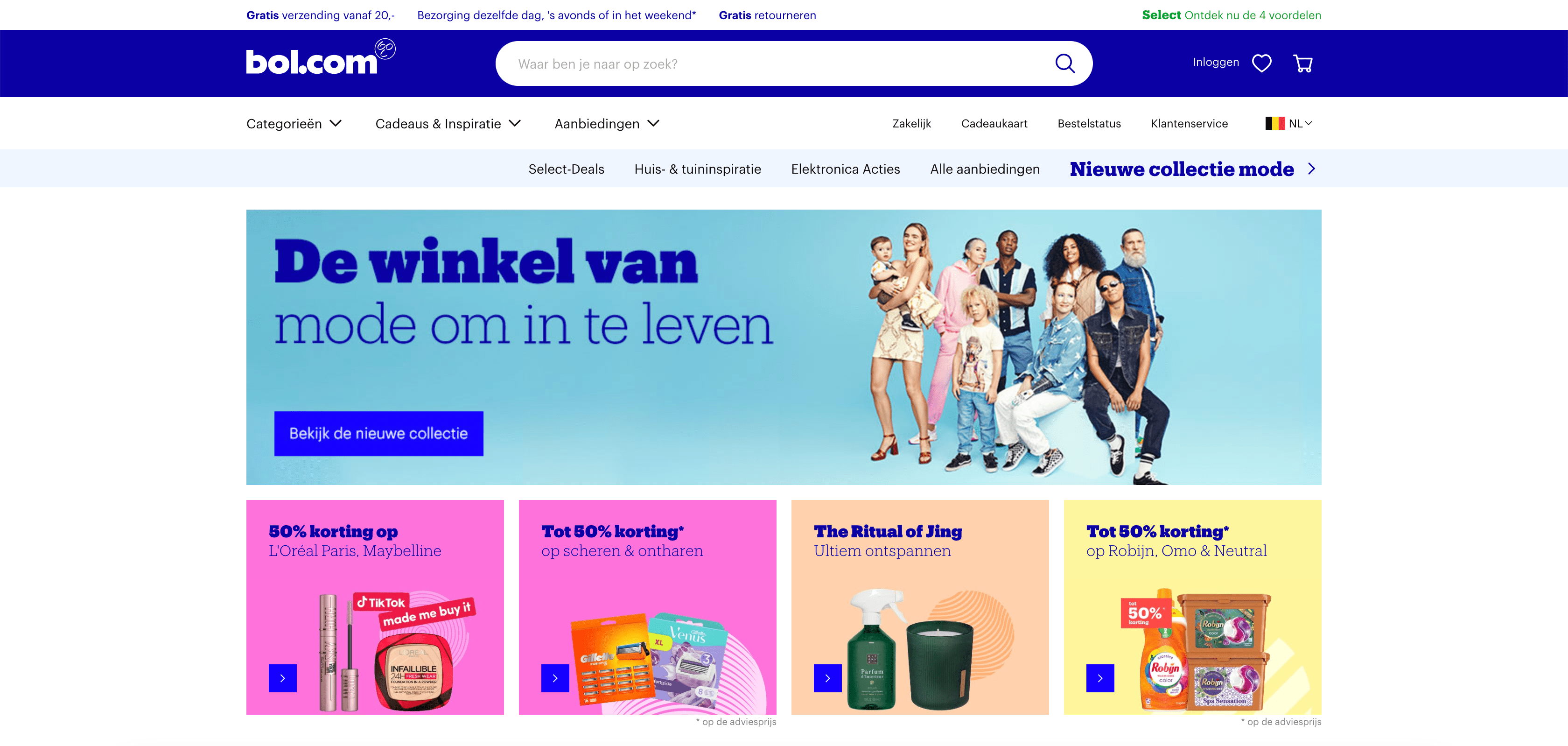
In spite of the name, white space does not need to be white. It can be any colour, texture or pattern. It could even be a background image.
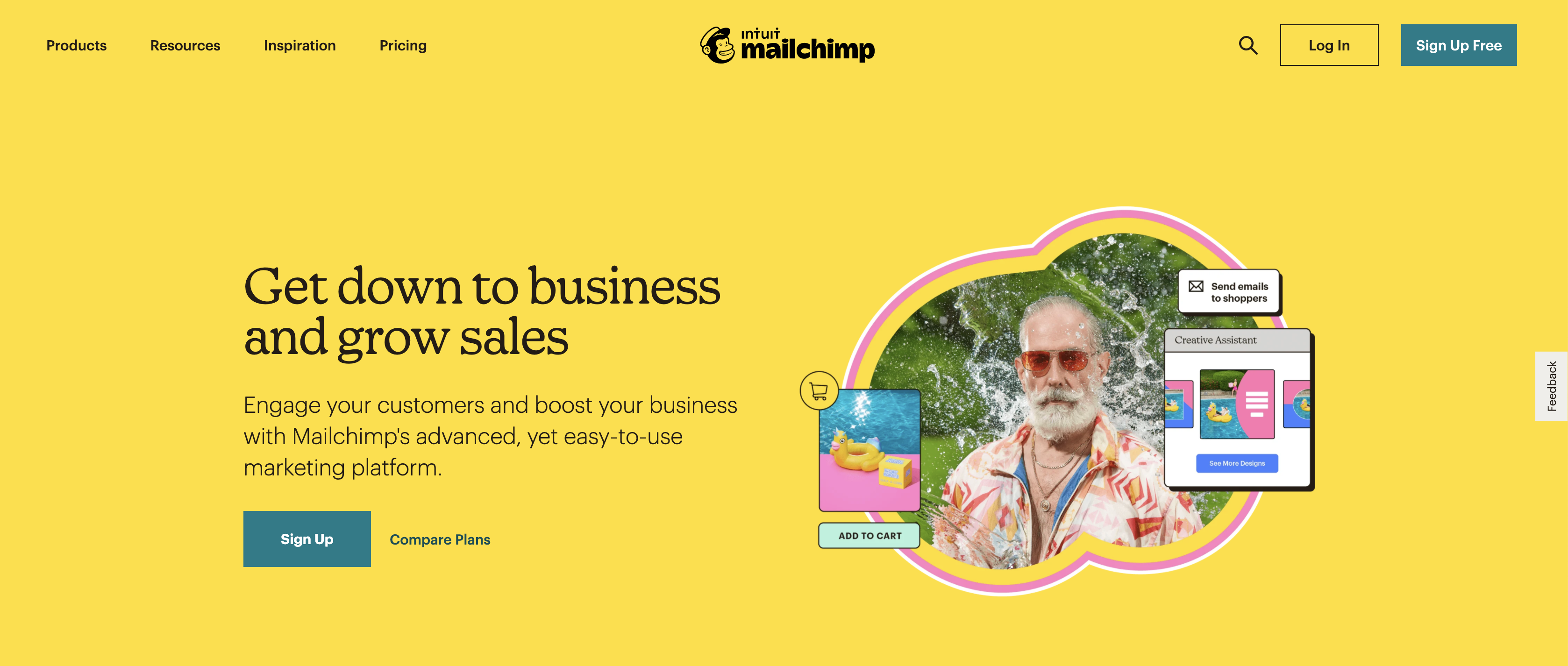
Unfortunately, white space can also create quite a few problems between designers and clients. The thing is, many clients consider white space as a waste of space, which they prefer to see filled with more on-screen information or extra features.
Which is a pity, as white space is very much a great aid to instil a sense of balance between standalone elements, enabling you to create calm and focus on your screen.
The reality is that, as people, we get frustrated when we are swamped with information. We are people, not machines. White space gives our mind a sense of calm and allows us to ‘breathe’.
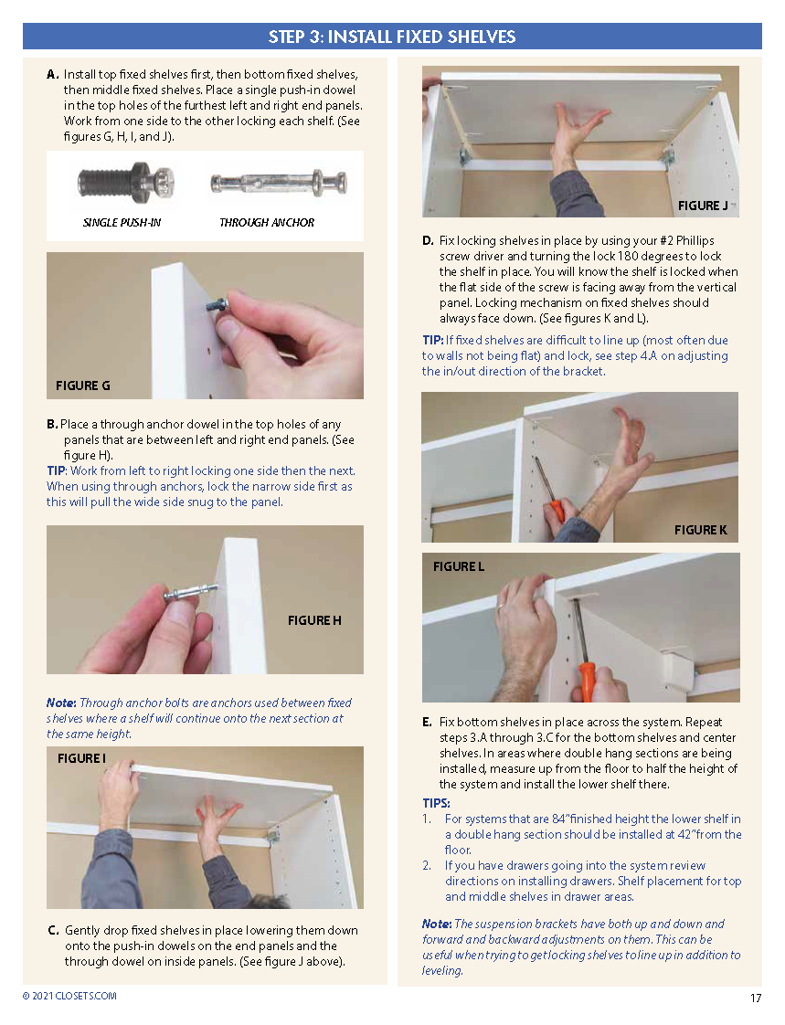
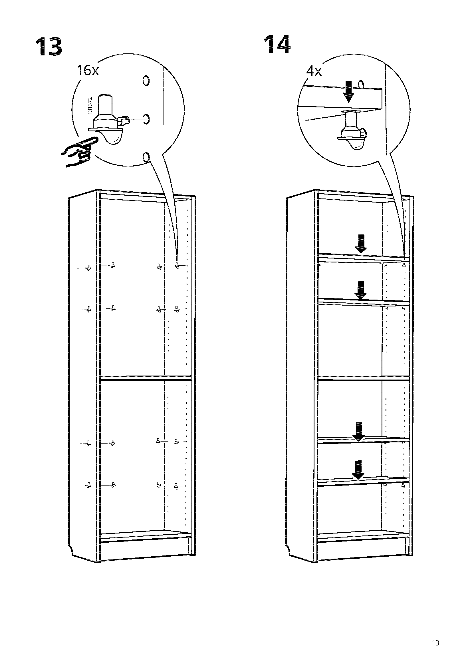
Let’s take an example we can all identify with by way of illustration. Few people ever read manuals for fun. Which makes it all the more crucial for the manual writers to hold DIYers’ attention! To do that, white space is the star of the show as it helps to bring out important visual elements. It helps to make sure that DIYers quickly and clearly know what they need to get started. Rather than calling a helpline, DIYers are enabled to resolve their problem by themselves. The Customer Service will thank you for it ;-)
In order to view this content, you need to accept Marketing & third party cookies.
Click here to adjust your preferencesHere too, it is important to strike the right balance: do not scrap elements that are conducive to achieving the user’s main aim. You want to give DIYers just the right amount of information to enable them to put together that cabinet, without feeling discouraged by the amount of information. It’s all about experimenting!
Conclusion
All of which goes to show that simplicity and focus are paramount when it comes to designing an interface. All elements, functionalities, texts and options need to come in support of the users’ main aim and should ideally be shown to users on a step by step basis.
Many designers struggle to translate all functionalities and requirements into a simple and straightforward design. Designers will always need to work hard to deliver a straightforward interface, so users know exactly what they are supposed to do, do not feel tired out after visiting the website or leave the website (prematurely).
Unfortunately, there is no standard recipe to address this. To a large degree it is the context that determines how a design works to best effect and the right ratio between minimalism and functionality. So do not be distracted by general best practices. Instead, properly trial run your flows to strike the right balance for your specific situation and target audience. Keen to find out how to run a proper test? Find out all about it in one of the next blog posts in this series (coming soon).
In the next blog post, we will continue to focus on a number of important basic features such as the search engine, microcopy and navigation. Stay tuned!
This blog is the second of a series of five blog posts that provide designers with first-hand tips and tools to get the user-friendliness of their digital designs just right.
Read all articles in this blog series:
- Tip 1: Fill your backpack with theory
- Tip 2: Instill focus and simplicity in interfaces (coming soon)
- Tip 3: Be aware of the importance of the most common interface elements (coming soon)
- Tip 4: Design interfaces for all users (coming soon)
- Tip 5: Gain a better understanding of your users by involving them (coming soon)
Looking for high-quality UX and UI design? Let us help you and take a look at what we offer!
In order to view this content, you need to accept Marketing & third party cookies.
Click here to adjust your preferences
