How ACA Group integrates accessibility into their projects and operations
The Global Accessibility Awareness Day takes place every year on the third Thursday of May with the aim of putting accessibility in the spotlight. For ACA Group, the accessibility, user-friendliness and inclusion of technology have long been an important focus. In this blog, you will discover some of our projects in which accessibility was high on the list of priorities.
The intention of the Global Accessibility Awareness Day (GAAD) is to get as many people as possible to think and talk about how technology can be made accessible to people with a disability. In this way, the initiative wants to contribute to a more inclusive digital world.
What is accessibility?
Digital accessibility means that digital technologies, such as online tools, applications and electronic documents are designed in such a way that they are accessible to everyone, including people with disabilities. This allows them, like everyone else, to continue to participate in the digital economy and society.
One of the most important aspects of accessibility is that people with visual, auditory, cognitive or physical disabilities can effectively perceive, understand, navigate and interact with digital content.
ACA Group's vision on accessibility
“Our sustainability policy is much more than our sponsorship of charities,” says Dorien Jorissen, Chief Digital Officer & Sustainability Manager at ACA Group. “We strive to analyze and integrate all aspects of sustainability into our operations. Accessibility is also an integral part of our sustainability policy.”
The SDGs (Sustainable Development Goals) of the United Nations form the basis of the sustainability framework of ACA Group. “We want to propagate this not only in our offices, in our team and with our stakeholders, but also in our digital services and our project methodology,” says Dorien.
“In a rapidly evolving world, in which technology is becoming more and more intertwined with our daily lives, as a leading IT company we are obliged to keep digital accessibility high on the agenda.”
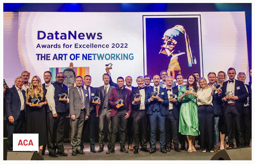
Below, a picture of ACA Group winning the DataNews Award 2022 for Most Environmentally Responsible ICT Company of the Year'👇🏻
Accessibility in practice
Below you will find three projects from ACA Group for which accessibility was an important design requirement.
⭐️ Mobile app for De Lijn with a focus on accessibility
Accessibility is very important to De Lijn. Not only in terms of easy access to their vehicles, but also in terms of their digital applications, such as the mobile app.
The challenge
The transport company wants their app to be accessible and user-friendly for everyone, including people with a visual impairment. They often rely on public transport and must therefore be able to use the app easily.
“In the past, people with a visual impairment could use a separate app that could better read out routes and real-time information,” says Joren Vos, Mobile Solution Engineer at ACA Group. “However, this app was outdated. In addition, De Lijn's general app also needed an update.”
The solution
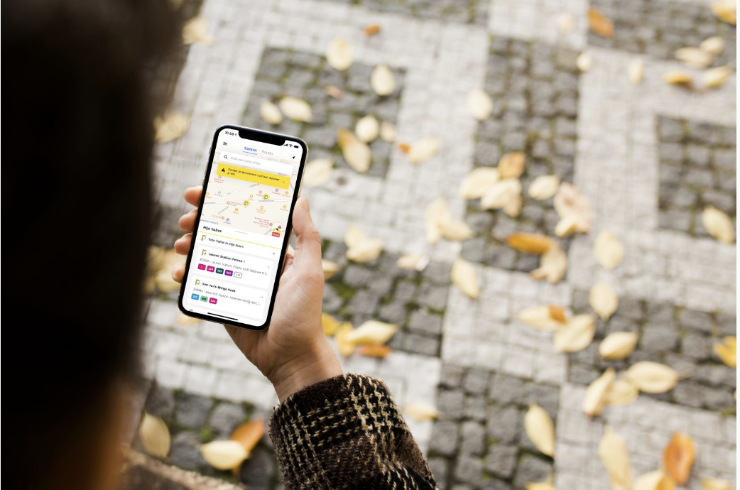
So there was a need for an update of both the regular De Lijn app and the BLS app. That is why it was decided to integrate the BLS app and the general De Lijn app into one user-friendly app for everyone.
“In the new design of the app, we focused on easy and user-friendly navigation,” explains Joren. “We replaced the old complex navigation structure with an easy-to-use navigation bar at the bottom of the screen. We also realized a clear context when reading from the screen, the support of larger text sizes and a voice-over."
“We also improved the real-time information and added a congestion barometer. This allows a traveler to see how crowded it is on a particular bus or tram.”
The result
Thanks to the new menu structure, the updated De Lijn app makes it much easier for everyone to buy tickets, map out public transport routes and search for stops and destinations. Thanks to new functionality such as voice over, exit warning notifications and the support for larger font sizes, people with a visual impairment can also easily use the app.
After an accessibility assessment by Eleven Ways and having obtained the required label, the De Lijn app can now officially call itself 'accessible'.
⭐️ ACA website according to Web Content Accessibility Guidelines
In 2020 we wanted to give the ACA website a redesign. Stijn Schutyser, today UI/UX designer at ACA Website, was involved in the project as a copywriter and SEO Specialist at the time. He says: “We think it is important to involve our colleagues in every phase of such a project. That is why we sent an initial proposal internally during the preparation phase. One of the ACA colleagues suggested that we should pay extra attention to accessibility for people with a disability from the start. Since inclusion is an important focus of our sustainability policy, we immediately started working on this fantastic idea.”
Web development according to international standard
“We decided to develop the website according to the Web Content Accessibility Guidelines,” explains Stijn. “It was the first time we would develop a website according to this international standard. That made it quite a challenge for our technical team: studying the guidelines, checking how we could best implement them, the coding, …”
“One of the most important targets was to make the website user-friendly for people who use a screen reader that reads the text on a website. For example, we have ensured that a screen reader jumps directly to the main content of a page at the touch of a button, without reading out the unnecessary content in the menu bar, etc..”
Audit by Eleven Ways and AnySurfer
“After the development and launch of the new website, we had it tested by Eleven Ways,” says Stijn. “They gave us some work points that we had to tackle in order to comply with the guidelines. After these adjustments, we had the site audited by AnySurfer with the aim of receiving the AnySurfer label level AA. That label proves that your website has been tested by AnySurfer and that it meets the WCAG standard to speak of an accessible website.”
By the way, did you know that the ACA website has a Lighthouse accessibility score of 98, an almost perfect score.
Accessibility will continue to be an important design parameter for our website in the future.
⭐️ How we improve the accessibility of PDF files
Accessibility is not only important for websites and apps. “Every piece of content should be accessible to everyone, including PDF files,” says Ibn Renders, Lead Branding at ACA Group. “That is why at ACA Group we ensure that our PDF files are adapted for people with a visual impairment who use a screen reader.”
Below, Ibn gives three tips to make PDF files accessible to everyone:
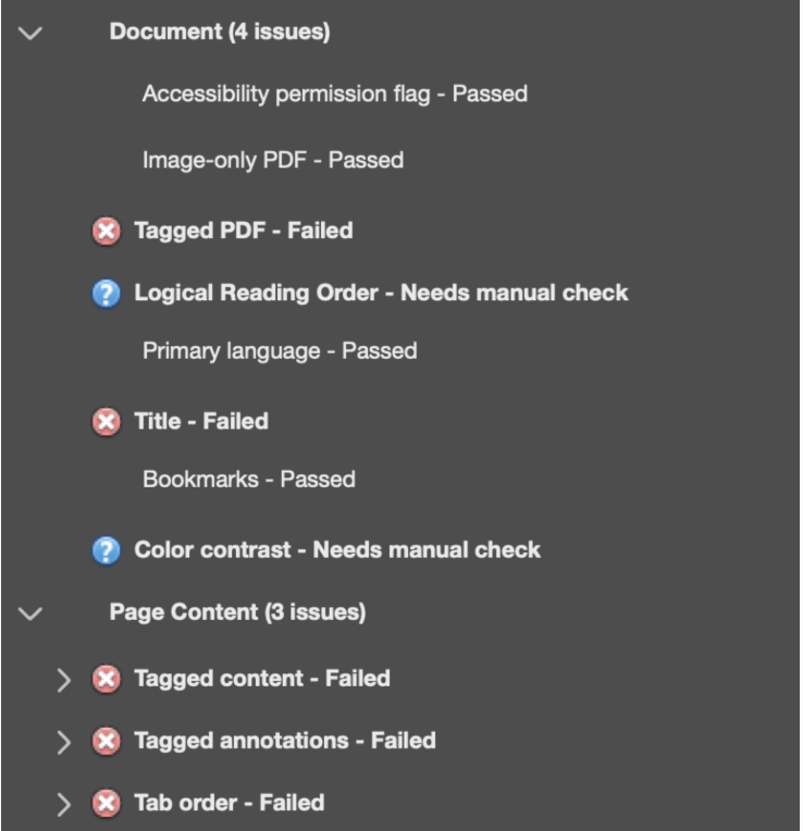
- Accessibility check: To improve the accessibility of our PDF documents, we use the 'accessibility check' feature of Acrobat Pro. This tool checks your document and indicates which things you should adjust.
- Reading order: It is important to structure your PDF file with the correct headings and paragraphs. If you don't, your document will become one big chaos for people with a screen reader. With Acrobat Pro, the accessibility options make it easy to determine the desired reading order.
- Alt text: Screen readers don't know what's on an image, audio, or video element. Fortunately, you can help them by adding an alt text with a short description of the relevant audiovisual element.
Want to know more about accessibility for PDF files? Read the blog article “3 easy tips to make your PDF files accessible to everyone”.
Conclusion
In an increasingly digital world, we need to ensure that everyone, including people with disabilities, continues to have access to online and offline digital solutions and content.
As a leading IT company, we want to take our responsibility with ACA Group to integrate accessibility into our services, our methodology and our solutions. We are already making a lot of efforts to achieve this, but it remains a continuous effort to do even better.
Looking for an IT partner who really understands you?

