Why does my application not always work the same way?
Take a good look at the example of a website header below. This header comes from the same website, but looks different depending on whether the user is on a different page:


Some differences:
- the labels Shop and Shop/Upgrade are not consistent,
- the blurred labels stand in a different place, like "Support" and "Account",
- "TV", "labels" and "Sign in" are sometimes labels and sometimes icons,
- the search function is missing in the top header,
- only the first header had a menu hamburger.
You may recognize this situation: as your application grows, the diversity of elements grows with it. Buttons on different pages are slightly different or not exactly in the same place, icons don't all belong to the same set, newer forms don't follow the same structure as previous ones, there are different fonts or sizes for the same purpose, and so on. That's annoying and downright messy.
It is worse when this inconsistency ensures that your application no longer works as expected according to your users because there is also too little consistency in the interaction patterns. This can lead to users using your application or part of it less and less or even stop working with it.
The importance of consistency
“Consistency” is an important metric that most companies underestimate. Consistency is a crucial part of any company with a digital platform or service. It not only ensures a user-friendly product, but also numerous other benefits including: a unified experience across different devices, correct implementation of branding, brand awareness and much more… We all recognize the importance of that consistency, but how can you ensure for now that you also guarantee this within your organization?
What is a 'design system'?
A design system is a central place where all components of a digital product or set of digital products are described. You can think of it as a kind of library in which different visual components are stored for use in your website, app or social media content. Color and typography are primary components in a design system, just like buttons, forms, footers, and other components.
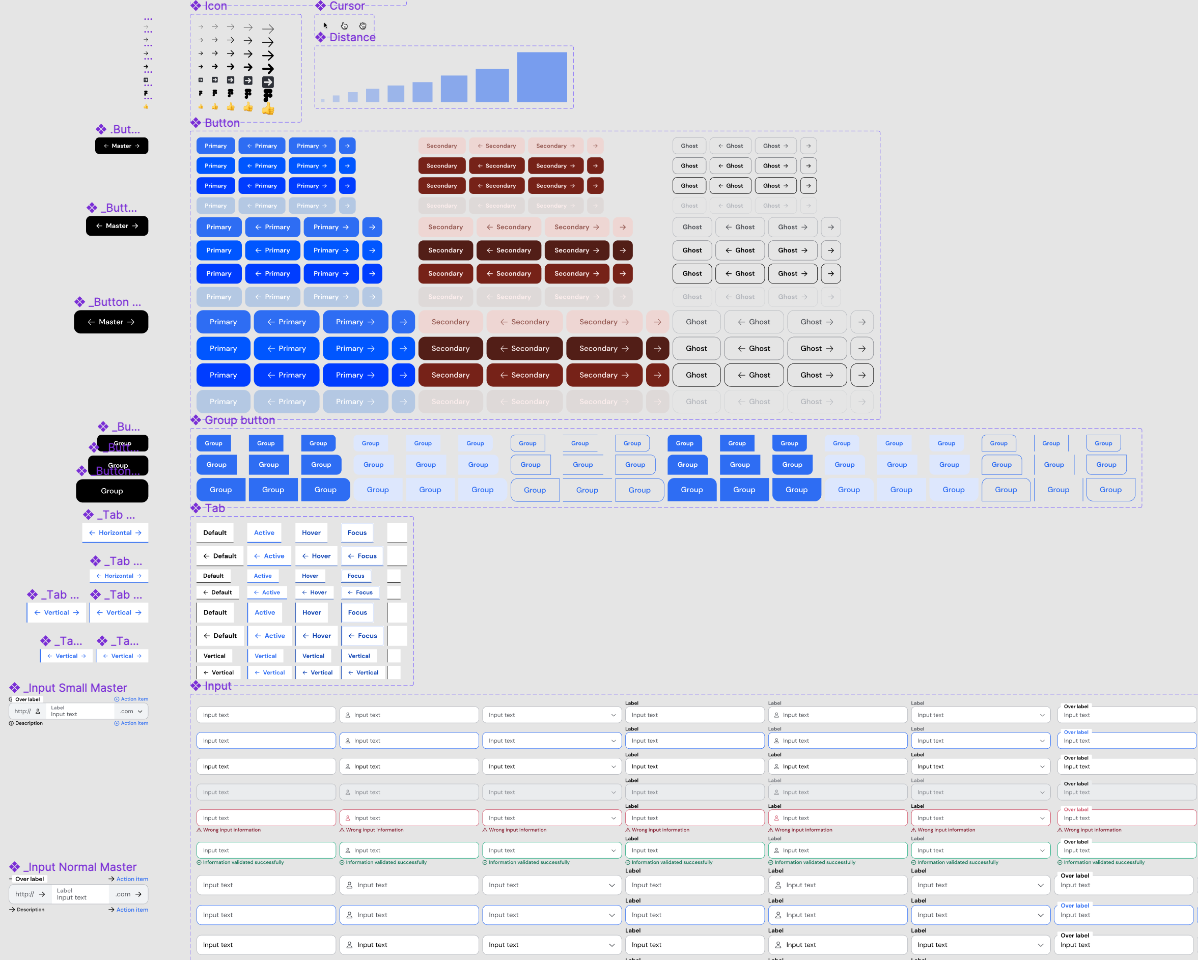
Design system 'Atomus', available for free design system within Figma
The advantages of a design system
The use of a design system has 3 big advantages:
- it creates more cohesion and consistency,
- iensures a high degree of reusability,
- and is very easy to use.
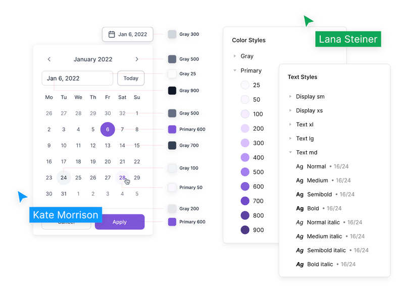
A design system helps to create a consistent brand image. Once you create a design system, it becomes the "single source of truth" for your visual identity. Everyone will be able to create designs that look and feel the same and work according to the same interaction patterns.
High degree of reusability
Your team can quickly design new components based on existing smaller elements called atoms. So you can always reuse your current atoms to create new things that immediately fit within the design and look & feel of your design system.
Quick and easy to use
Existing or new colleagues who have less experience with UX or UI design can help create modern, user-friendly and beautiful interfaces. This speeds up your developers' work and increases your efficiency!
In addition, this efficiency also offers another advantage, namely that changes in your product or service can be implemented very quickly. This means that you can realize a much faster time-to-market.
Do you recognize one or more of these challenges?
Do your applications sometimes suffer from inconsistent operation or visual display and are you curious about how you can remedy this with a design system? Or do you have questions about exactly how you can set up a design system to ensure that you do not run into problems in terms of consistency?
Then book a free and non-binding slot in our agenda for a Q&A session below. During this meeting we are happy to listen to your questions and give you specific advice.
