User-friendly and accessible mobile app for De Lijn
The Flemish Transport Company De Lijn is an external autonomous agency within the Mobile & Public Works policy domain of the Flemish Government. De Lijn provides urban and regional public transport in, from and to Flanders, and wants to be the partner for sustainable and future-oriented mobility services. Our experts are currently working on other various projects at De Lijn. You can read all about our intense collaboration in this case study.
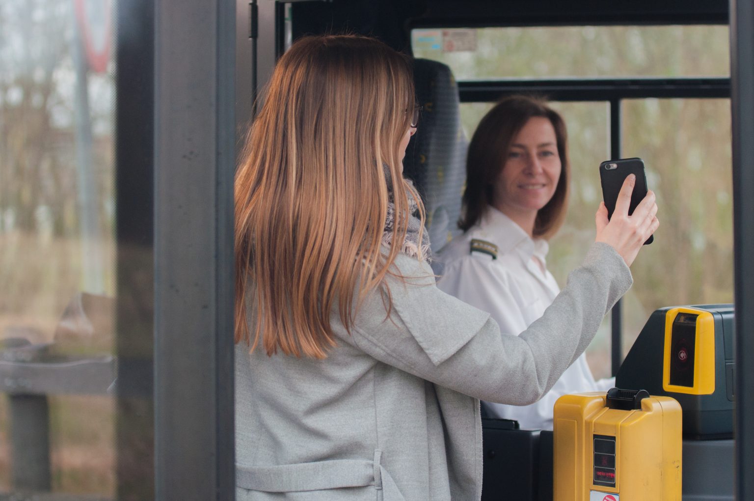
The challenge: an accessible mobile application
Accessibility is a very important aspect to De Lijn. That is why, for example, they only buy vehicles with a low step and elevated bus stops are (re)constructed in many places in Flanders to make it easier to get in and out of their vehicles.
This focus on accessibility also extends to De Lijn's mobile app. After all, the transport company wants users to be able to consult the app in a simple and user-friendly way. In addition, visually impaired users often rely on public transport, making it crucial to make the mobile app as user-friendly as possible for all audiences.
The last target audience often uses screen reader technology, such as VoiceOver on iOS and TalkBack on Android, where all information is read out loud from the screen. Previously, people with a visual impairment could consult a separate De Lijn app for this: De Lijn BLS. This app was optimized to better read out routes and real-time information. This application has become outdated in the meantime and is no longer provided with important updates.
Besides that, the 'normal' app of De Lijn was also due for renewal. This mobile app contained a complex navigation structure with a “hamburger menu” that was insufficiently user-friendly. After all, users had to keep pressing the menu button to navigate to certain sections of the app. Analytics showed that hardly any use was made of this menu button, while many functions were already available in this app, such as purchasing tickets, consulting the route planner, etc. There was therefore a need for renewal of both the regular De Lijn app and the BLS app.
The solution: a renewed and user-friendly mobile app for everyone
To ensure user-friendliness for all users, the existing mobile app was completely renewed. During this renewal, extra attention was paid to increasing the user-friendliness and accessibility of the app. The BLS app has been integrated into De Lijn's existing updated app, which is now able to read out routes and information about a stop. In addition, a new route planner has been integrated and users can see even more accurate real-time information.
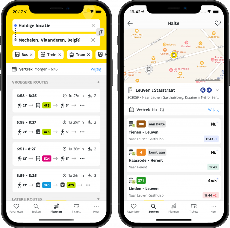
In the new design of the app, we mainly focused on easy and user-friendly navigation, providing clear context when reading the screen and supporting larger text sizes. This means that De Lijn can call its app accessible, and they are more than ready for accessibility audits for mobile applications in the public sector.
In addition to the visual renewal of the app, we also worked on other innovations and improvements. With the motto "what is real-time, can still be real-timer" we looked at possibilities to make the app even more reliable for users.
Improved real-time info and a crowd barometer
At the start of the projects, we focused on improving the basic functionalities such as improving the real-time information and integrating the crowd barometer. With this crowd barometer, a traveler can see how busy it is on a particular bus or tram.
In terms of real-time information, we have made tremendous progress. In 97% of the cases, the traveler can check the app to see when a bus or tram will arrive at the stop. More than 92% of the information shown corresponds to reality with a margin of one minute or less. In addition, travelers can save routes as favorites and future trips are made easier because these routes can be quickly found in their own profile. The home screen shows the favorite stops along with the real-time information.
A user-friendly app
After improving the basic functionalities and real-time information, we mainly shifted our focus to the design and user-friendliness of the app to make traveling even more comfortable. We replaced the previous hamburger menu with a navigation bar at the bottom of the screen. This gives users easy access to the various functions of the app, including purchasing tickets, plotting routes by train, tram, metro or bus, notifications for departure warnings and personalized information.
You can find the new app in the App store and Google Play Store.
Related customer success stories
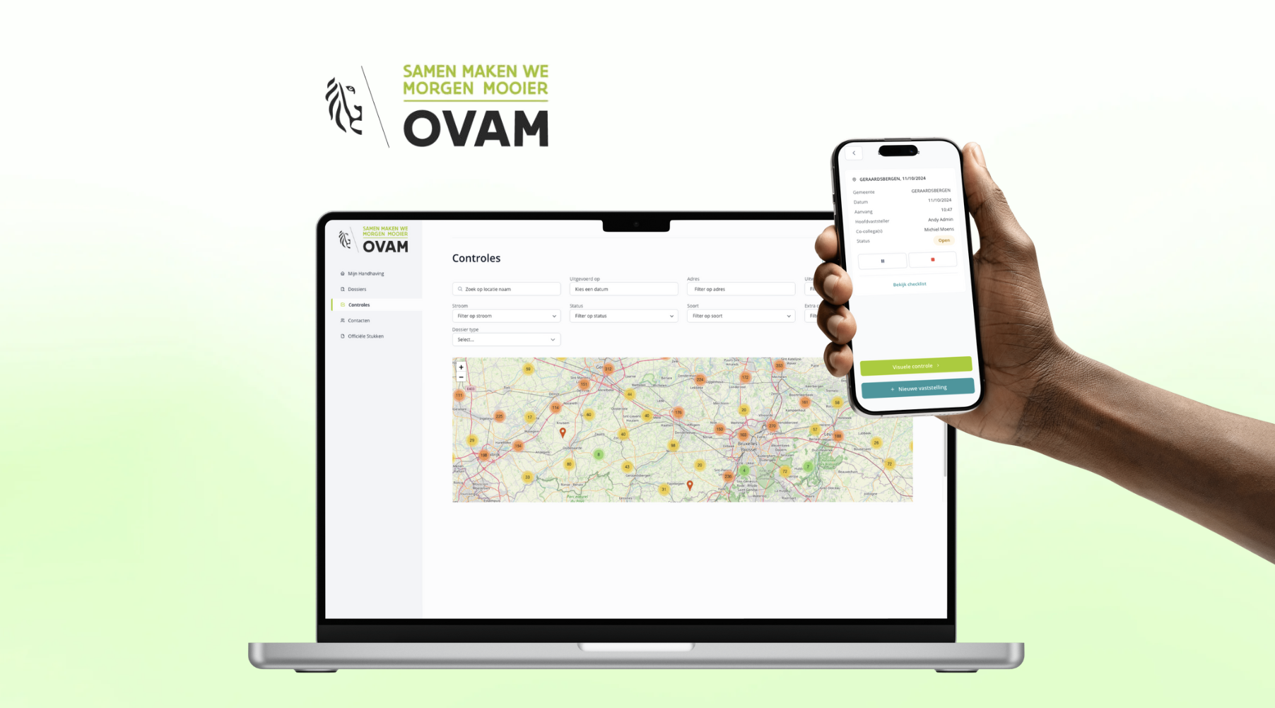
- OVAM accelerates digitalization with Low-Code: fast, efficient, and cost-saving
OVAM accelerated digitalization with Low-Code. Learn how they partnered with ACA Group to replace outdated systems and boost efficiency.
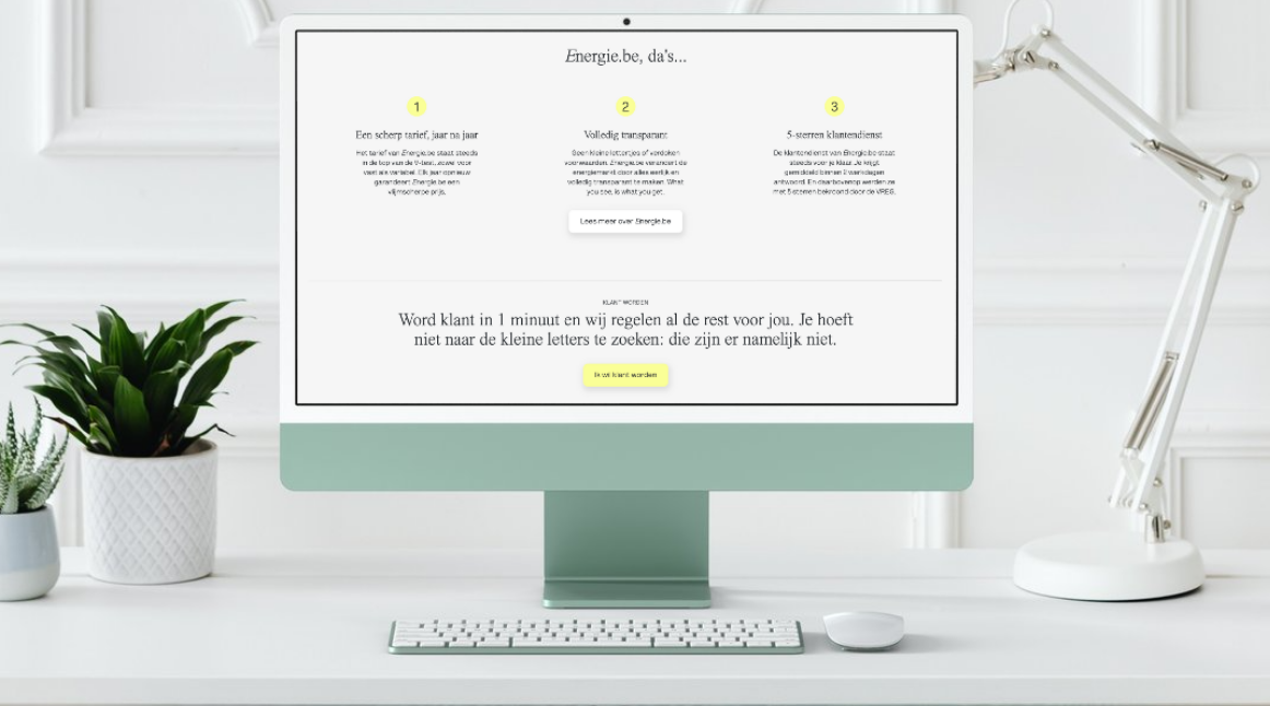
- Energie.be and ACA Group develop Tariefcheck: quickly and smartly compare energy contracts
Energie.be and ACA Group developed the Tariefcheck: a quick tool that calculates how much you can save on your energy contract, with a potential benefit of up to €1,000 per year. Simple, clear and efficient.
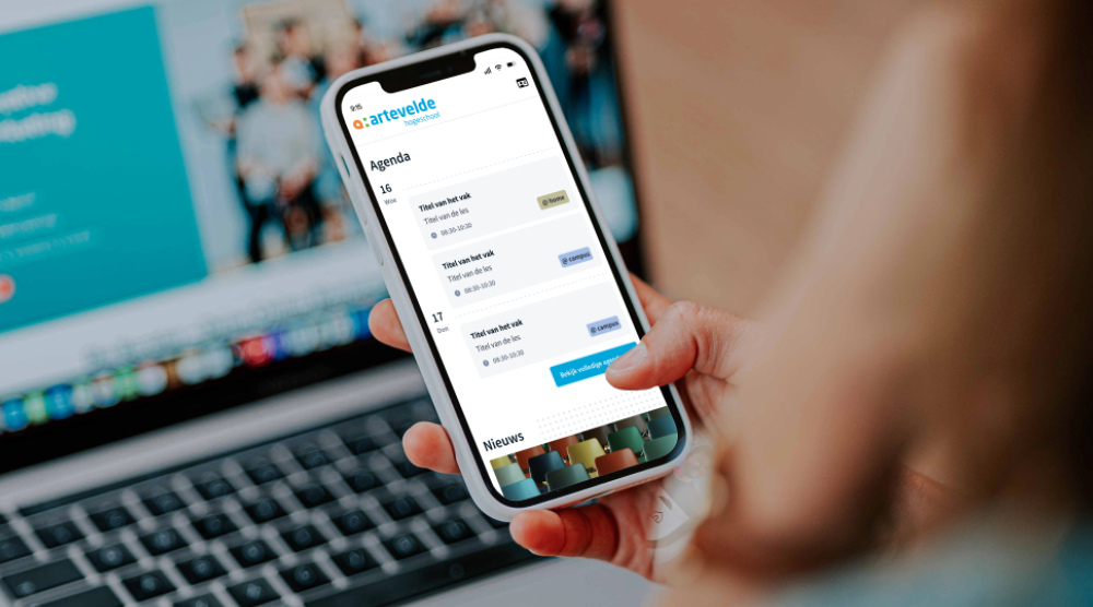
- Innovative student app optimizes communication flow in Artevelde University of Applied Sciences
Artevelde University of Applied Sciences teamed up with ACA Group to create a central mobile app, streamlining scattered information and communication into one seamless experience.
